Mastering mobile landing page design: Tips, best practices, and examples
It’s essential for businesses to ensure they have a website that works as well on mobile devices as it does on desktop screens. In particular, the design of a mobile landing page is crucial to achieving success, as it’s often the first interaction a potential customer will have with your brand.
Become a website builder reseller the easy way by downloading the “6-Step Guide to Selling Website Services to Local Businesses” now.
A well-designed mobile landing page can make all the difference in helping convert visitors into customers. In this article, we’ll go over some important tips and best practices you should follow when creating a landing page design for mobile, as well as some great examples of mobile pages for inspiration.
Tips for designing a landing page for mobile
Designing an optimized mobile landing page is essential to ensure potential customers have a positive user experience and convert into loyal customers. Following these tips will help ensure your mobile landing page is user-friendly and helps increase conversions and, ultimately, make your business more successful.
1. Keep it simple and focused
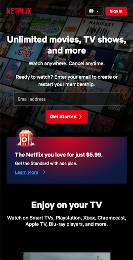
The landing page for Netflix is an excellent example of a mobile landing page that just keeps it simple. The page's design is clean, uncluttered, and easy to navigate, making it easy for users to find what they want. It follows best practices by removing unnecessary elements, and providing a clear and concise user interface. The page also focuses on speed, with optimized images and minimal text to facilitate faster download times.
- The top portion of the page follows the simple and concise design principle, featuring only a few clear options, including a search bar, account settings, and a hamburger menu to access more options.
- The page uses high-quality images and a simple font that is easy to read, highlighting the content without overwhelming the user.
- Load times are optimized by reducing the number of images and text that could slow down download times. The page has also been optimized for touch, with large buttons and easy-to-read text to facilitate better user interaction.
2. Use a responsive design
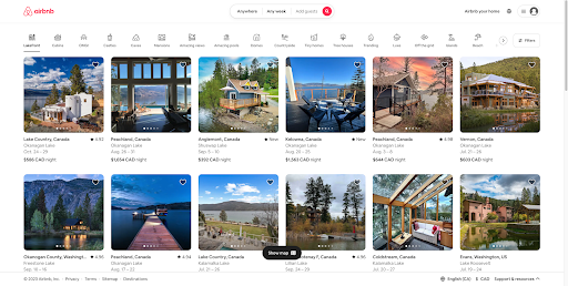
This means that the page is designed to adjust to fit the screen size of the device, whether a mobile phone, tablet, or desktop computer.
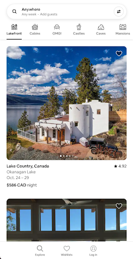
One example of a landing page that executes the best practices of using a responsive design is the landing page for Airbnb. The page adjusts seamlessly to different screen sizes, ensuring that the user's experience is not negatively affected by the size of their device.
- A responsive design ensures a consistent user experience, regardless of the device used to view the landing page. It also improves the likelihood of conversion, as users are more likely to engage with a page that is easy to use and navigate on their device.
- Easy-to-navigate menus and high-quality images highlighting the offered product. The page is optimized for speed, ensuring it loads quickly on different devices.
- The page ensures a consistent user experience and is optimized for conversion, with easy navigation and a focus on the offered product.
3. Make sure it loads quickly
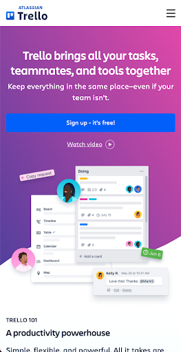
Slow loading times can result in a high bounce rate and poor user experience, reducing the likelihood of conversion. One example of a landing page that best executes this best practice is the page for Trello, a popular project management tool.
The page's design is uncluttered, with clear and concise language, making it easy to scan and understand. The page prioritizes a minimalist design, reducing the coding involved and ensuring that the page loads quickly on mobile devices. Images and animations are used sparingly, only when necessary, to demonstrate the offered product visually. This prioritization of essential design elements helps to keep the page load time fast and ensures a positive user experience.
- To optimize images and minimize code, compress images so they don't take up too much space and prioritize high-quality images essential to demonstrating your product or service.
- It's also a good idea to eliminate any unnecessary elements from the page, such as large videos, autoplaying music or animations that can slow down load times.
- Prioritize a minimalist design that reduces the amount of coding involved, helping to ensure that your landing page loads quickly on mobile devices.
4. Prioritize the most important information
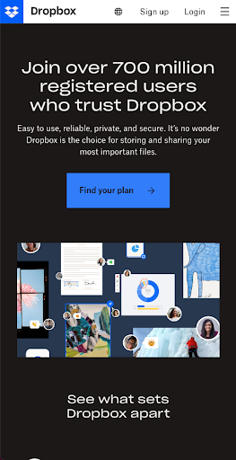
This involves placing the most critical information at the top of the page where it's easily visible to your audience instead of burying it beneath lots of other content. One example of a landing page that exemplifies this best practice is the page for Dropbox, a cloud storage provider.
The page uses a minimalist design, with only a few high-quality images and an easy-to-use interface to guide users to essential information: what the product is, how it works, and how to sign up. It's also important to use clear and concise headlines to communicate your message, ensuring that users understand the key information quickly and efficiently.
- The most important information is highlighted at the top of the page, with a clear headline for each section that communicates the key message in only a few words.
- The design is also optimized for speed, ensuring the page loads quickly on mobile devices.
- Bulleted lists and small amounts of text are used throughout the page to break up the content, making scanning and reading easier.
5. Use clear and concise language
This means incorporating language that is easy to understand and avoids jargon or technical terms that may confuse your target audience. It's also important to use short paragraphs and bullet points to make your message more scannable, as many mobile users may use their devices to browse the page quickly.
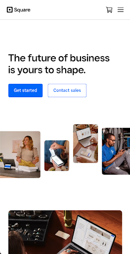
Square's mobile landing page is an excellent example of using clear and concise language to communicate your message effectively on a mobile landing page. By focusing on the most critical information, using simple language and emphasizing scannable content, the page effectively communicates its message and helps increase conversions.
- The page uses an uncluttered design that focuses on the most important information: how the platform works and its benefits for small businesses.
- The language used is simple and to the point, avoiding technical terms and focusing on essential information.
- Short paragraphs and bullet points are used throughout the page to make the information easy to read and skim through quickly.
6. Use visual hierarchy to guide the user's attention
This involves using visual cues such as font size, color, and placement to direct your audience's attention to the most important elements on your page.
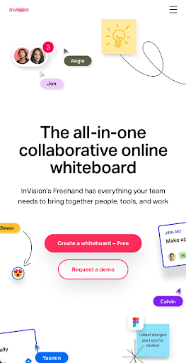
One example of a landing page that does this well is the page for InVision, a prototyping and collaboration tool. The page prominently displays its critical features at the top, using bold fonts and bright colors to draw attention.
- The design also uses other visual cues, such as arrows and lines, to create visual pathways that guide users through different content sections. These elements help draw attention to different page parts without being too intrusive or overwhelming.
- Emphasizing the most important information with font size, color, and placement, directs users' attention where it needs to be quickly and easily, increasing the chances of conversion.
- Further down the page, they use smaller font sizes and muted tones to emphasize the central message while de-emphasizing secondary information.
7. Use high-quality images
The use of visuals can be an effective way to communicate your message and evoke an emotional response from your audience.
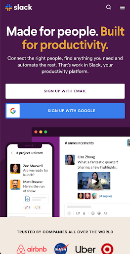
One example of a landing page that does this well is the page for Slack, a workplace chat platform. On the top of the page, they use a powerful image of people working together that speaks to their core mission: helping teams collaborate more effectively.
- These images are all high quality and relevant to the message they're trying to convey, helping users quickly understand how their product works without needing to read long paragraphs of text.
- They also include several other images throughout the page illustrating how their messaging products work and how various customers use them.
- Choosing high-quality, relevant images that help communicate your message can create an emotional connection with potential users and help increase conversions.
8. Include a clear call-to-action (CTA)
One example of a landing page that does this well is the page for Shopify.
Like Shopify, your CTA should be prominently displayed on your page and should communicate what action you want your audience to take. To make it easier for users to act, use action-oriented language and ensure the CTA is easy to find and understand.
- At the top of the page, they have a big, bold CTA button with text stating their offer: "Start Your Free Trial Now."
- Emphasizing their main message in bold and using action-oriented language makes it easy for potential customers to take action.
- They also include smaller CTAs with text that emphasizes why users should act now ("Get Started Today"), helping to create a sense of urgency.
Best practices for mobile landing page design
By following these best practices for mobile page design, you can create an engaging website experience explicitly tailored for users browsing from their phones or tablets to help grow brand awareness and increase conversions from mobile visitors.
1. Use a clear and legible font
Another best practice for designing a mobile-friendly landing page is to use a clear and legible font. It's essential to choose a font that is easy to read on mobile devices and ensure that it is large enough to be readable even when users don't need to zoom in.
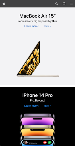
One example of a landing page that does this well is the page for Apple, the iconic technology company. They use a consistent font size and style throughout the page, making their content easy to read on any device.
- Their font size is large enough so users can easily read it without needing to zoom in or scroll around the page.
- They use typography effectively in their mobile design by choosing a clear, legible font that works across all devices.
- You help ensure your content is engaging and readable for all your visitors.
2. Use a high contrast color scheme
Using a high-contrast color scheme is another best practice for designing a mobile-friendly landing page. One example of a landing page that does this well is the page for Nike, the sportswear giant. Throughout the page, they use bold colors that contrast their white background and black text.
Choosing colors that provide a clear contrast between the background and the text is essential to ensure your message is easily communicated and legible.
- They use color effectively in your mobile design by choosing a high-contrast color scheme that works across all devices.
- All content on their page stands out and can be easily read by viewers on any device.
- Doing so can help ensure your message is visible and legible for all visitors.
3. Keep the layout consistent
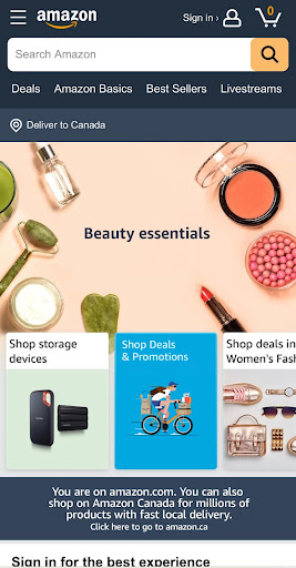
A consistent layout is another best practice for designing a mobile-friendly landing page. It's important to use a consistent layout across all sections of your landing page to ensure that it provides a cohesive user experience and is easy to navigate. One example of a landing page that does this well is the page for Amazon, the online retail giant.
- Throughout the page, they use a typical style for their layout, including full-width images, bold headings, and clearly defined sections, which helps to create an inviting and unified look and feel.
- Their responsive layout allows users to access information on any device by scrolling up or down.
- Keep your design simple yet effective by creating a consistent look throughout all sections of your website.
Following this practice can ensure an enjoyable browsing experience for all your visitors.
4. Use white space effectively
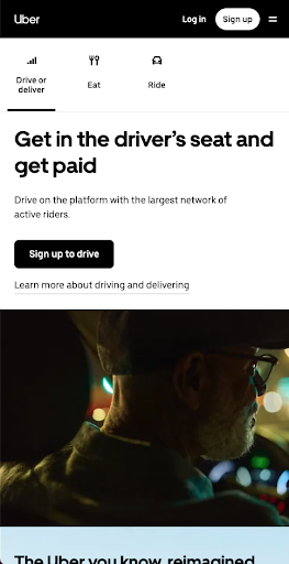
Another best practice for designing a mobile-friendly landing page is to use white space effectively. One example of a landing page that does this well is the page for Uber, the ride-sharing giant. Throughout their page, they use white space to separate each section and highlight key features of their services.
- Incorporating white space into your design is vital to separate different elements on your landing page and help draw attention to the most important information.
- Ensures visitors have a seamless experience by quickly identifying the most important information on your page.
- This helps create a clear visual hierarchy and lets visitors quickly identify the most relevant content.
Overall, Uber showcases an excellent example of how you can use white space as an integral part of your mobile design.
5. Avoid pop-ups or interstitials
One of the critical rules for creating a mobile-friendly landing page is to make the content concise. It's important to ensure visitors can easily find the information they need quickly by providing clear and concise text.
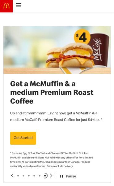
For example, McDonald’s uses a minimalistic approach on their landing page with very brief and direct text.
- This allows visitors to identify all important details without unnecessary content quickly.
- Having only a little unnecessary content on your landing page is essential to create an enjoyable user experience for visitors.
- Brevity is key, as you want users to be able to handle the information at once and find what they are looking for.
6. Make sure it's easy to navigate
Ensuring your landing page is easy to navigate and understand is essential. Use clear and concise navigation menus and buttons, as this will help guide users to the content they need quickly and efficiently.
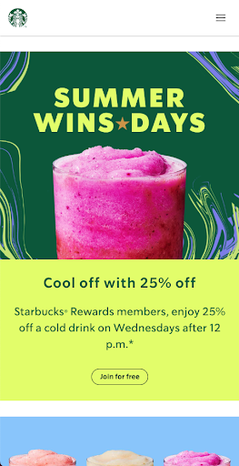
For example, Starbucks uses a design-forward approach on their landing page that emphasizes its brand image but also assists visitors in quickly deciphering what content is most relevant for them. They use visuals along with concise descriptions of each section which helps make navigation more efficient for users.
- Ensure an easy-to-understand navigation menu with concise descriptions of each section.
- Use visuals such as images, videos and animations to draw attention to key information on your page.
- Use a design approach that emphasizes the brand image and helps visitors quickly find what content is most relevant.
When designing, it is important to consider how users will interact with your landing page. Use visuals, succinct text, and logical navigation menus to ensure visitors find what they need quickly and enjoyably on your page.
7. Test your landing page on different devices and screen sizes
A mobile landing page optimized for all devices and screen sizes is essential to ensure optimal user experience and conversion. Here are three key tips to keep in mind when testing your page on different devices and screen sizes:
- Implement responsive design techniques so the content appears correctly regardless of device type or size.
- Include interactive components such as forms, CTAs and other elements that have been tested for usability across multiple devices.
- Test your page regularly across various devices and screen sizes, including desktop, tablet, and smartphone.
Frequently asked questions
What size should a mobile version landing page be?
The ideal mobile page size should generally be between 50 and 100KB. This will help ensure that your page loads quickly and efficiently on any device.
What is the best image size for mobile websites?
For optimal performance, all images used on mobile websites should be optimized for the device’s smaller screen size, with an image size of no more than 200KB. Optimizing images will further improve the loading speed of your page and provide users with a better overall experience.


